Colorwonder
the brief
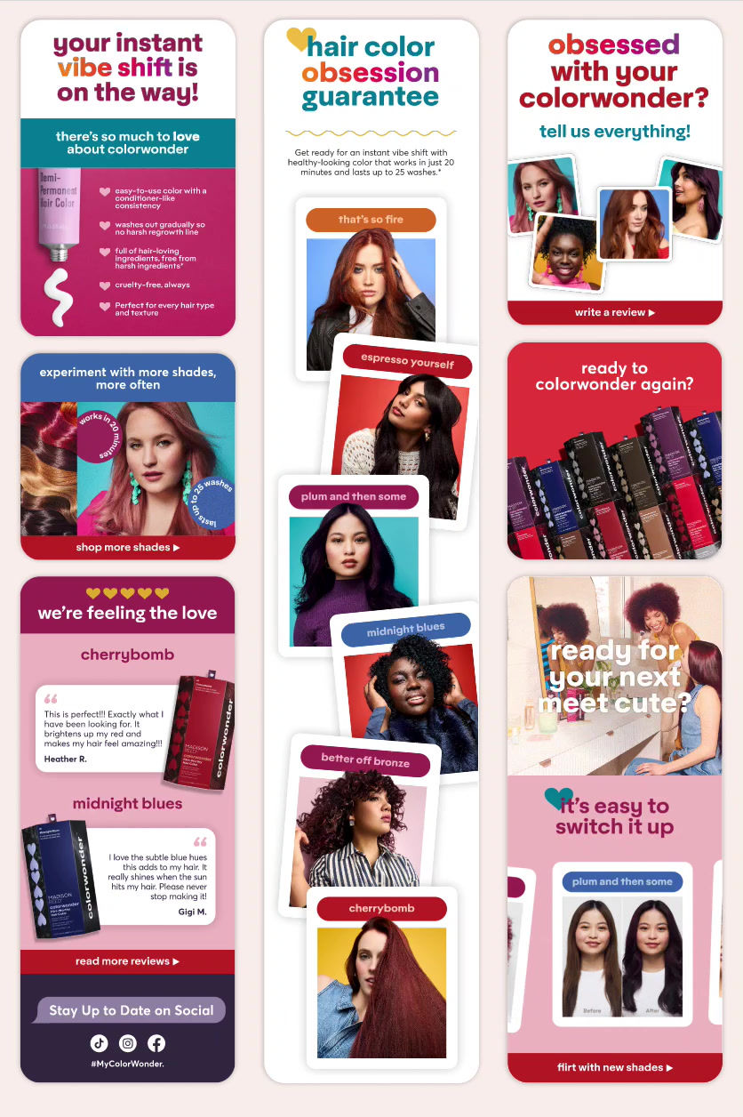
Launch a new line of demi-permanent hair color shades targeted towards a younger audience. Build a cohesive creative system spanning packaging, campaign assets, and digital storytelling. Deliver model and packaging photography + video to support launch assets across multiple channels.
challenges
Create a fresh aesthetic that feels distinct yet still lives within the Madison Reed ecosystem. Balance shade education + variety, brand and clarity across campaign visuals.
my role
Photo + Video Art Direction • Lead Designer
Collaborators: SVP Creative, Art Director, Video Editor


For years, Madison Reed focused on permanent hair color for a 35–65 audience seeking gray coverage. Over time, this missed a growing market for flexible, temporary options.
Enter ColorWonder, hair color you can flirt with.
Packaging needed to educate clearly: what it is, what it does, and who it’s for without being visually overwhelming. The hexagonal structure allowed for thoughtful information hierarchy while maintaining the branded aesthetic.
We wanted to ground the results in real performance, and show diversity in hair type and texture. to achieve this, we colored and photographed real hair for the packaging, creating an opportunity for authenticity and diversity.


We built a lifestyle series inspired by a get-ready-with-me moment, showing friends picking outfits, sharing a drink, and having fun together. This added a flirty, social-forward tone that connected naturally with Gen Z audiences.