Robbins Brothers
Homepage

Robbins Brothers
Homepage
DESCRIPTION
This has been an ongoing project at Robbins Brothers for the past year or so. We've been working on rebranding our homepage with more of the Robbins Brothers brand benefits.
ROLES
Web Design
Typography
Icon Design


CURRENT DESIGN
This is the current design of the homepage. It is comprised of mostly images, no live content, and does not leave a lot of room for opportunity. The page is pretty stagnant and only really has space to feature merchandise or promotions.
OBJECTIVES
• Modernize the Design
• Add Robbins Brothers Value
• Explain the Business Model
• Surface Compelling Content
• Make Shopping Easily Accessible

ROUND #1 DESIGNS
This is where we started with the redesign. We changed a lot of things here, and although it was an improvement, its not where we felt comfortable landing. With this design, we added a lot of opportunity to feature the Robbins Brothers brand and community. Part of what makes the Robbins Brothers stores different is the experience and the life-long community. Here we could feature the merchandise as well as promotions, but we also had space for the learning center, social media, newsletter and blog features.
However, this felt a little busy. We wanted to try something with more of a simple, transparent approach. People come to this site to look for jewelry, and learn what the shopping experience at Robbins Brothers offers them as a customer, and that's what we wanted to feature, so I did another round of designs.

ROUND #2 DESIGNS
This is where we went with round 2 of designs. We wanted to bring the homepage to the modern world of web trends! We felt that people shopping our site wanted to know more about what was in it for them. There are so many competitors in the engagement ring world, and some that are 100% online. With online shopping being the preferred experience for most of our customers, we needed to show why the in-store experience at Robbins Brothers was worth-while for them.
With these designs, I followed the same basic format: Introduce the brand, show them what they are looking for (the ring), explain why Robbins Brothers is different (and what's in it for them), show why other customers like us (testimonials), then give them the tools to be better engagement ring shoppers. All while keeping the Robbins Brothers brand voice consistent. We liked this format, but this isn't where we landed design-wise.

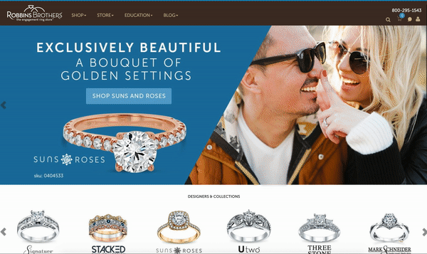
ROUND #3 DESIGNS
Here is where we have landed with the designs. We felt that this design best exemplified the heart of the Robbins Brothers brand. Here, we give the customer the information and tools they need to make an informed shopping decision.
WHY WE LANDED HERE:
• New header, footer, and menu
• Balance of merchandise:couple imagery:brand message
• Cleaner design
• Brings informational hierarchy to the page
